Let's be direct. Your banner ads are probably getting ignored.
"Banner blindness" is real. It's torching your ad spend. The average click-through rate for display ads is a dismal 0.06%, according to Google's benchmarks. But it doesn't have to be your story.
Why Your Banner Ad Design Is Failing
If you're running display ads, chances are you're frustrated. You pour time and money into banners, launch the campaign, and then… crickets. Clicks are low, sales are lower. It feels like you're lighting money on fire.
This isn't bad luck. It’s a design problem. Most banner ads fail because they're built on assumptions, not a repeatable system. They lack a single, clear purpose and just add to the digital noise.
The hard truth is you have less than three seconds to get your point across.
We've seen hundreds of brands struggle with this. They cram too much information into a tiny space. They use weak visuals. Or they forget the most critical piece: a clear call to action.
Effective design isn’t about being the loudest. It’s about clarity.
The Three Pillars of Banners That Convert
We've run thousands of campaigns. Every successful banner ad nails three things. Get these right, and you'll go from being scrolled past to getting clicked.
A Clear Value Proposition: What are you offering? Why should anyone care? This needs to be understood in a heartbeat.
Compelling Visuals: Your image has to stop the scroll. It must be relevant to your product and your audience.
An Unmissable Call-to-Action (CTA): What do you want them to do next? "Shop Now," "Learn More," or "Get 20% Off" has to be impossible to miss.
These elements work together to fight "banner blindness." This is the phenomenon where users subconsciously ignore ads. A study by Infolinks found that 86% of consumers suffer from it.
"The most common mistake I see is a banner ad that tries to say three things at once. I always tell my clients to pick one thing. Are you trying to sell a product, promote a sale, or get an email signup? You can't do all three in 300x250 pixels."
— Joe Sparacino, Marketing Creative Expert
Your Creative Brief Is Your Foundation
You can't expect a great banner without a great brief. This is where most campaigns die before a single pixel is designed. A vague brief leads to a vague ad.
Arm your designer (or yourself) with the context they need. Don’t just ask for “a banner.”
Your creative brief should be a simple, focused document. It outlines the one goal of the ad. Is it to drive traffic to a new collection? Announce a sale? Retarget cart abandoners? Each goal demands a different design.
To see what the competition is doing, run a quick competitor ad analysis. See what's working (and what's not) in your space. This guide shows you how to build a system for banners that get results.
Focus on Banner Ad Sizes That Matter
Don’t get bogged down designing for every possible ad placement. A small handful of sizes drive nearly all the results. Trying to cover every spec burns through your creative budget and your team's sanity.
The game is about focusing your energy where it counts. Certain dimensions get the most inventory on platforms like the Google Display Network (GDN). By prioritizing these, you maximize your reach without creating a mountain of assets.
This focused approach means you can spend more time perfecting the creative for the formats people will see. It’s the 80/20 rule of banner ad design.
The Undisputed Workhorses of Display Ads
If you only have the budget for three banner sizes, make them these. They are non-negotiable for any DTC brand. They represent the vast majority of available ad inventory.
Medium Rectangle (300x250): This one is king. It’s incredibly versatile, fitting into sidebars and content on desktop and mobile. Its popularity means massive inventory.
Leaderboard (728x90): Usually placed at the top of a page, this wide format grabs attention. It’s perfect for a strong first impression with a bold headline.
Mobile Leaderboard (320x50): Do not ignore this one. With over 60% of web traffic on mobile, according to Statista, this small banner is essential.
Stick with these three. You've covered most of your bases with minimal effort.
Expanding Your Reach Strategically
Once you've nailed the core three and have a winning concept, expand. A few other high-impact sizes are worth your time. These formats are top performers but aren't as universal.
Consider adding these next:
Large Rectangle (336x280): A slightly bigger, more impactful version of the Medium Rectangle. We’ve seen this perform well embedded in article content.
Half Page (300x600): This large vertical format is impossible to miss. It commands a ton of screen real estate in sidebars. It's a great canvas for strong lifestyle imagery.
Think of these as your second wave. Test your creative on the core three. Find what works. Then adapt that winning design to these additional sizes.
Matching Sizes to Ad Platforms
Here’s where many brands slip up. The sizes you need depend on where you run your ads.
The Google Display Network heavily favors sizes like the 300x250 and 728x90. But on Meta, the game changes. Meta’s creative is about aspect ratios, not fixed pixel sizes. For those campaigns, you’ll want square (1:1) and vertical (4:5 or 9:16) formats.
"The biggest mistake we see is brands creating one set of banners and running them everywhere. Google Display Network and Meta’s Audience Network are different beasts. You have to tailor your sizes to the platform to avoid weird cropping and wasted impressions."
— Dave Rekuc, Marketing Director, Rip Curl
Getting this right is crucial. For a deeper dive, check our guide on Meta ad creatives that are built for the platform.
Top-Performing Banner Ad Sizes for DTC Brands
To make things simple, here’s a quick reference guide. These are the dimensions we see deliver the best results for DTC brands.
Focusing on these five gives you maximum coverage without overcomplicating your process. Start with the top three, validate your creative, then expand.
Crafting Visuals and Copy That Convert
You get less than three seconds to earn a click. That's it. In that tiny window, your banner ad has to cut through the noise, show people what's in it for them, and convince them to stop scrolling.
This isn’t about making something pretty. It's a disciplined game of visual hierarchy and copy that connects instantly. Every element in your ad either pulls the user's eye toward the click or pushes them away.
Guiding the Eye with Visual Hierarchy
Visual hierarchy is the secret weapon. It's how you control what someone sees first, second, and third. Get this right, and you create a smooth, unconscious path from seeing the ad to clicking it.
Think of your ad as having three jobs, in this exact order:
Grab Attention: This is your hook—a compelling image or a bold headline.
Communicate Value: This is your value proposition. Why should they care?
Drive Action: This is your call-to-action (CTA). It must be the final, unmissable element.
A simple, effective trick is using high-contrast colors for the CTA button. If your ad has a light background, use a bold, dark button. If the background is dark, go with a bright color. It sounds obvious, but many ads get this wrong.
Battle-Tested Copy Formulas for DTC
Your copy has to land its punch immediately. Forget long sentences or corporate jargon. We rely on a few simple, repeatable formulas that work for DTC brands. This is about clarity, not cleverness.
The goal is to connect with a pain point or desire right away. We've collected powerful ad copy examples you can adapt for your campaigns.
Here are the frameworks we use almost daily:
Benefit-Driven Headline: Lead with the outcome, not the feature. Instead of "Our moisturizer has hyaluronic acid," try "Get Visibly Hydrated Skin in 7 Days."
Problem-Agitate-Solve (PAS): Start with a problem ("Tired of restless nights?"). Agitate it ("Poor sleep ruins your focus."). Then present your product as the solution ("Our blackout curtains guarantee better sleep.").
Offer-Centric: This is your direct, no-nonsense approach. It’s perfect for sales. "Flash Sale: 40% Off Ends Tonight." The urgency is built-in.
"The best ad copy doesn't sell a product; it sells a feeling or a result. Nobody wants to buy a mattress. They want to buy a great night's sleep. Your copy needs to make that connection in two seconds or less."
— Joanna Wiebe, Founder, Copyhackers
Animation That Grabs Attention, Not Annoyance
Animation can be a game-changer. But it’s incredibly easy to overdo it. The goal is to capture attention, not to create a seizure-inducing disco party on a webpage. Subtle, simple animations are almost always more effective.
A simple 10-15 second loop is all you need. Focus on animating just one or two elements. This creates a gentle sense of motion that draws the eye without being obnoxious.
Here’s what works:
Fade-in Text: Have your headline or offer fade in after a second.
Subtle Zooms: A slow, slight zoom on a product image can be magnetic.
Color Change CTA: Make your CTA button gently pulse or change color to make it the focal point.
Restraint is key. According to Google, HTML5 animated ads should be under 15 seconds and not loop endlessly. It’s about respecting the user's experience.
Balancing Brand and Call to Action
Your branding needs to be there, but it shouldn't be the star. Many founders slap a huge logo in the middle of their ad. Frankly, unless you’re Nike, your logo isn’t what gets the click.
Tuck your logo into a corner—top left or bottom right are standard. Keep it clear, but let it be a supporting actor. Its job is to build brand recall over time.
The hierarchy should always flow like this:
Main Visual/Headline (The Hook)
Value Proposition (The "Why")
Call to Action (The "How")
Logo (The "Who")
Stick to this structure. Your banner will be laser-focused on its one job: getting that conversion.
A/B Testing Banners Without the Chaos
Testing is non-negotiable for banner ads. But most brands make a mess of it.
They test a dozen variables at once. They get muddy data. They end up more confused than when they started. It’s chaos. Forget that approach.
The key is to simplify. Test one big thing at a time. Stop agonizing over five shades of blue. Focus on the levers that actually move the needle.
What to Test for Maximum Impact
After running thousands of campaigns, we’ve found three core elements drive most of the performance. Test these, one by one. You’ll create a powerful cycle of constant improvement.
The Core Visual: Your scroll-stopper. Test a clean product shot against a lifestyle image. This tells you if your audience responds to aspiration (lifestyle) or clarity (product).
The Headline: Your value prop in five words or less. Test a benefit-driven headline against an offer-driven one. "Get a Perfect Night's Sleep" versus "Save 30% on Our Mattress."
The Call-to-Action (CTA): The final nudge. "Shop Now" is the default. But something specific like "Get 20% Off" or "Claim Your Discount" can often crush it.
By isolating these big variables, you get clean data. You stop guessing and start building on what works.
Setting Up Your Tests in Meta
You don’t need a complicated setup. Setting up a simple A/B testing campaign in Meta Ads Manager is straightforward.
Here's the interface where you’ll define your variables and audiences.
This is where you choose your campaign and pick a single variable to test. Set the key metric that will determine the winner, usually Cost per Result.
When creating your campaign, use the A/B test feature to duplicate your ad. Change only one thing. Ad A gets the product shot. Ad B gets the lifestyle image. Everything else—audience, budget, placements—must be identical.
Meta takes care of the rest. It automatically splits the budget and keeps the results clean.
"The single biggest mistake we see brands make is changing multiple things at once. If you test a new image and a new headline, you’ll never know which change drove the results. Be disciplined. One variable at a time. Always."
— David Ogilvy, Founder of Ogilvy & Mather
When to Call a Winner
Don't jump the gun. Calling a test too early is as bad as not testing at all. You need statistical significance. This is just a way of saying the results aren't a fluke.
Most ad platforms tell you when a test hits this mark. As a rule of thumb, wait for at least 1,000 impressions per ad variation. Let the test run for at least 4-7 days. This gives the algorithm time to learn.
You’re looking for a clear winner. If one ad has a 20% lower Cost per Acquisition (CPA) and the platform says the result is 95% significant, you have your answer. Kill the loser. Promote the winner to your new control creative.
This process becomes your engine for growth. The winner of your visual test becomes the control for your headline test. The winner of that test becomes the control for your CTA test. You're constantly iterating.
For more advanced setups, you can explore powerful tools. Learn more about Dynamic Creative Optimization in our article and see how it can automate some of this testing for you.
Using Retargeting Banners to Close the Deal
A visitor who leaves your site without buying is your warmest lead. Full stop. They’ve already raised their hand and shown interest. Your job is to remind them why they came. This is where a smart retargeting banner turns window shoppers into customers.
Forget generic brand ads. For this audience, your banners need to be hyper-relevant. They should feel less like an ad and more like a helpful nudge. They already know you.
Design for Context, Not Just Clicks
The secret to good retargeting is context. Your ad needs to feel like a continuation of the conversation that started on your website. Not some creepy follow around the internet. Many brands blast the same generic ad at everyone, causing ad fatigue.
We've found two strategies that work for DTC brands:
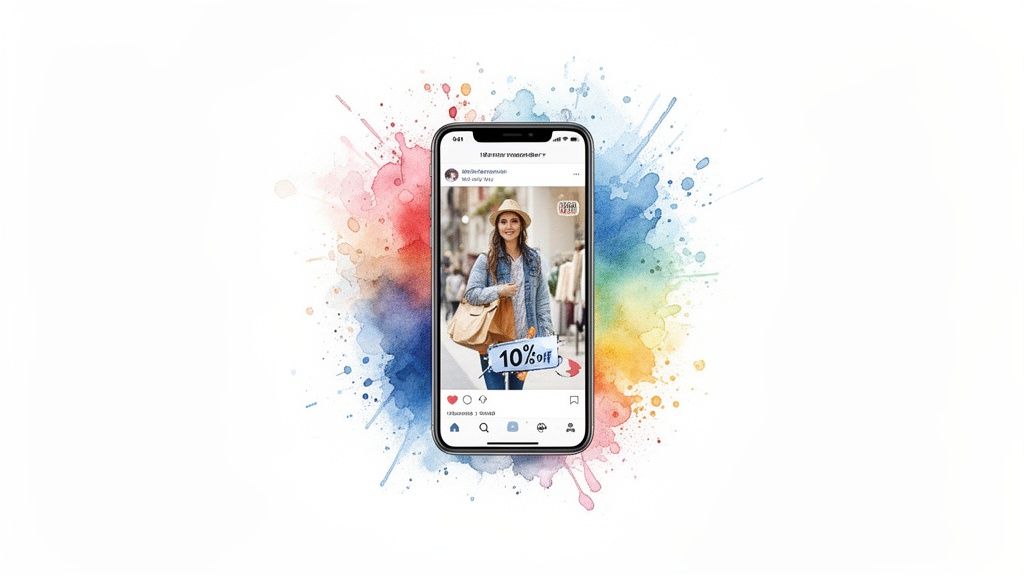
Dynamic Product Ads: Your secret weapon for abandoned carts. They automatically pull in the exact product image, name, and price of the item a user viewed. It's a powerful, personalized reminder.
Offer-Based Banners: For someone who browsed but didn't add to cart, a small, compelling offer is the perfect incentive. A simple "Still thinking? Take 15% off" is direct and effective.
The design needs to be clean and focused. The product they viewed or the offer you're making should be the hero. Don't clutter it.
Sequencing Your Banners Over Time
You can’t show someone the same ad for 30 days straight. Ad fatigue is real. A better approach is to sequence your messages based on how long it's been since their last visit. This keeps your brand top of mind without being annoying.
This isn’t theory. It’s a repeatable system we use to turn abandoned carts into cash.
Here’s a simple timeline for sequencing retargeting creative:
Days 1-3 (The Hot Window): Purchase intent is highest. Hit them with a Dynamic Product Ad showing what they viewed. The copy should be a simple reminder, like "Forgot something?"
Days 4-14 (The Nudge): If they still haven't bought, sweeten the deal. Swap the creative to a banner that includes a small discount. "10% Off Just For You" can reignite their interest.
Days 15-30 (The Brand Reminder): After two weeks, the specific product is less relevant. Switch to a broader brand message. Show a lifestyle image with your bestsellers.
"Your retargeting banner shouldn’t scream, 'We're tracking you!' It should whisper, 'Hey, remember this cool thing you liked?' The difference is everything. A helpful reminder closes deals. A creepy follow kills them."
— Neil Patel, Co-founder, NP Digital
This tiered approach respects the user's journey. Retargeting isn't just a tactic; it's a critical part of your sales funnel. Learn more in our guide on what retargeting is in digital marketing.
The impact is hard to ignore. An effective retargeting strategy makes site visitors 70% more likely to buy, according to research from Software Advice.
Common Banner Ad Questions from Founders
We get it. You're a founder moving a million miles an hour. You just need straight answers. Let's tackle the banner ad questions we hear most often.
What Are the Biggest Mistakes You See in Banner Ad Design?
The number one killer is clutter. Trying to cram too many messages, clashing visuals, or a vague call-to-action into a tiny rectangle is a surefire way to get ignored. The goal is always one clear focus.
Another classic slip-up is bad branding. Your logo has to be there, but it shouldn't be the star. It’s a supporting actor, not the lead.
And maybe the biggest mistake? Failing to design for mobile first. This leads to squinty text and bizarrely cropped images on the small screens where most customers will see the ad.
What Metrics Should I Actually Care About?
Look past vanity metrics like Click-Through Rate (CTR). For any DTC brand, the numbers that move the needle are Conversion Rate and Return On Ad Spend (ROAS). The only real question is: are your clicks turning into cash?
A high CTR with zero sales is a red flag. It means your ad attracts clicks from the wrong people, or your landing page isn't delivering on the ad's promise. Also, watch View-Through Conversions. Banners build brand recall and often get credit for sales that happen days later.
How Often Should I Refresh My Banner Creative?
There's no magic number. You have to be vigilant about ad fatigue. The second your CTR or ROAS starts to dip, it’s time for a refresh.
For high-volume campaigns, this could be every 2-4 weeks. For smaller efforts, you might get 4-6 weeks out of a winning creative. The trick is to have new concepts ready to go, based on your A/B tests. That way, you can swap out tired ads without pausing your campaigns.
If you're thinking about handing this off, it's worth checking out reputable Google Display Advertising companies that can manage this for you.
Should I Use Static or Animated Banner Ads?
Both have their place. Always start with high-quality static ads. They're quick to produce and inexpensive to test.
"Start static, validate the message, then animate. Don't waste time and money animating a concept that doesn't convert in the first place."
— Susan Wojcicki, Former CEO of YouTube
Once you’ve found static concepts that are clear winners, then turn them into simple animated ads. A subtle animation—like text fading in—can boost visibility and CTR. Just stay away from flashy, distracting animations that scream "spam."
Banner Ad Design FAQ
What banner ad sizes should I start with?
Always start with the Medium Rectangle (300x250), Leaderboard (728x90), and Mobile Leaderboard (320x50). These three cover the majority of ad space on the Google Display Network and give you the best reach.
How many banner ad sizes do I really need?
For a typical campaign, starting with the 3-5 top-performing sizes is enough. There's no need to create dozens of variations. Focus on quality over quantity and tailor your sizes to your ad platforms.
Are dynamic retargeting ads hard to set up?
Not anymore. Platforms like Meta and Google have made it simple. You install their tracking pixel on your site and upload your product catalog. The platforms handle the rest.
What color should my CTA button be?
Contrast is everything. The button color needs to stand out from the background. Colors like orange and green are popular, but a high-contrast button in any color will beat a low-contrast one every time.
What's the single most important metric for an A/B test?
For DTC brands, it's almost always Cost per Acquisition (CPA) or Return on Ad Spend (ROAS). A high Click-Through Rate (CTR) is nice, but if those clicks don't convert into sales, it's a vanity metric. Focus on the numbers that hit your bottom line.
Running a brand is chaotic enough. You don't need to be a banner ad expert, too. Needle acts as your AI marketing agency, handling the creative, setup, and optimization so you can focus on your product. We turn your data into campaigns that actually work, with 48-hour turnarounds.
Get best-in-class agency output at 1/3 the cost at https://www.askneedle.com